Friday, April 10, 2015


Repetition Rhythm;
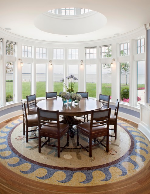
The repetition of a specific item(s) in a room making for a very organized look can make a room look more formal.


Radiation Rhythm;
When the room itself or certain things it the room move in a circular motion drawing the eyes out and often times making the room look larger.


Gradation Rhythm:
Gradual change of color for example in the picture at the right the slow movement from the cream, to tan, to brown or in the picture in the middle and at the left the change in size of the wall decor or polka dots.


Friday, March 20, 2015

Textures

Texture

I filled this room with many fun textures and colors.
I textured looking wall paper that is much different from the soft couch and sewn pillows.
I pick a stool with studs up the sides and around the top to off set that fuzzy rug and the rigid vases on the glass coffee table. I wood cabinet in the back has shutters with a bumpy texture and gives a bit of a rustic look to this elegant room. I think the texture makes that space look lively and fun. It is exactly the type of room i want to fill my future home with. Fun and up beat!

Thursday, March 19, 2015

Color Schemes
For my first Olio board i choose to do a bathroom. I included pinks, blues, greens, and then a little cream and brown in the sink and stool. I think the wall paper made the space look a little bit small but it gives a very peaceful feeling for a bathroom. A nice place to relax and shower or simply to get ready for the day. I Love how the space turned out.


color schemesa

For my second Olio board i did a bedroom. I choose to use greens, oranges, browns tans and cream. I think it gives a peaceful feeling and kinda reminds me of fall which i find to be the prettiest season because i love the combination of these colors together.
Color Schemes 3
For my third Olio board i sort of re created my own bedroom. I love the combination of the brights and darker colors together. My room gives me and everyone else a big sense of relaxation with the minimal lighting and white walls. These colors make the room seem larger then it is becausw the white walls create a more spacious feeling.

Tuesday, March 10, 2015

1. Some of the factors that influence the psychological impact that color has on people are age, gender, culture, and life experiences.
2.Each color has a different affect on people and how it makes them feel for example...
Red; red will give a sense of power, danger, strength, passion or fire
Green; green will make you feel at peace and give more of a cool, natural feel
Violet; violet will give off a dramatic and dignified feeling
3. Secondary colors are colors that are made when you mix an equal amount of two primary colors mixed together; the secondary colors are:
Orange: made up of red and yellow
Green: made up of yellow and blue
Violet: made up of blue and red
4. The primary color is always stated first in a tertiary color
5. Intensity is the brightness or dullness of a color; value is the lightness or darkness.
6. A tint is when white is added to the color; a shade is when black is added to the color; a shade is when grey is added to the color.
7. you neutralize a color by adding black white or grey to the color.
8. There are two color groups, warm and cool: warm colors would be colors such as red and orange; cool colors would be colors like blue and purple
9. There are seven color harmonies listed below and how you use them:

  •  monochromatic; a single color hue
  • complementary color; using colors that are directly across one another on the color wheel are complementary colors
  • slip complementary colors; using a hue with two hues adjacent to its compliment 
  • double complementary; using two colors and their compliments
  • analogous colors; using related hues from the color wheel
  • triadic colors; using any three colors that are equally spread out form each other
  • neutral colors; combinations of black white and grey even though they are not "hues"

10. Some things that would effect the color harmony a person chooses would be their all around mood, lifestyle, gender, age and much more!
11. Some of the factors that play into harmonies use din planning would include the space you have to decorate , and who you are decorating it for.
12. If you were dealing with someone who can not differ between two colors you should always just fill the space with a happy color because what are the odds if you put yellow in the wall they will see black? They would maybe see a color like green or purple, another happy or bright color.
13. I would suggest a color that never seems to disappoint maybe a shade of green or rustic orange they both give off a relaxing feeling but would go along with the northern feeling the room gives off.

Friday, February 6, 2015

Home Roofing Styles

Gable Roof: A roof with two sloping
sides, forming a triangle at one or
both ends.


Gambrel Roof: A roof with two
angles of slope on each of two the                                                         lower slope steeper then the upper.
 Hipped Roof: All four sides of this roof slope inward to meet at a ridge or peak.
                                                 Mansard Roof: All four sides of this                                                  roof have two slopes, the lower four                                                    steeper then the upper four.
 Saltbox Roof: A variation of the gable
roof, originally created when a low lean-to
addition was built onto the back wall of a house.

                                                          Shed Roof: A simple one slop                                                              roof; also called a lean-to roof.